NOTE: If you aren't already familiar with the fundamentals of menu engineering, please read topics listed below before proceeding with this topic.
•How can I make Menu Engineering work for me?
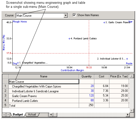
Resort Bistro prints and displays menu engineering results in both graphical and tabular form. Interpreting the tabular data is easy enough as it's all in labelled rows and columns which are largely self-explanatory. Interpreting a menu engineering graph can take a little longer to get used to, but once familiar with them, you should be able to take in an entire sub-menu at a glance.
The following screenshot shows the menu engineering details for a sub-menu within a parent menu. We'll be using this (very) simple sub-menu to explain how to interpret a menu engineering graph. You will note that there are only four items in the sub-menu and, rather conveniently, each of them has a different overall menu engineering ranking (Star, Dog, etc.). We've created artificial figures for this example in order to exaggerate some of the menu engineering results for clarity.
Axis labels
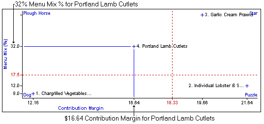
Lets start by looking at the axis labels on the graph. The vertical axis is labelled 'Menu Mix %". Values on this axis represent the percentage of overall sub-menu sales that each menu item accounts for. Using the Portland Lamb Cutlets menu item as an example, we see on the graph above that it's menu mix% is 32% which makes sense as we expect to sell 80 serves of this item out of a total of 250 main courses [(80 / 250) x 100 = 32%].
The horizontal axis is labelled 'Contribution Margin'. This is just a fancy way of saying 'Gross Profit'. That is, the price of the product minus the food cost. We see in the graph above that the Portland Lamb Cutlets have a contribution margin (CM) of $16.64.
NOTE: We refer to currency values as dollars ($) here, but it all works equally well for other currencies. Just substitute your currency for $ in these notes.
The following image highlights the menu mix and contribution margin for Portland Lamb Cutlets in the menu engineering graph.
Thresholds and Rankings
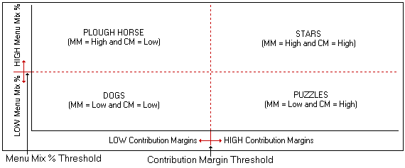
When calculating menu engineering figures for a sub-menu, Resort Bistro needs to determine threshold values for both menu mix percentage and contribution margins. These threshold values are used to determine whether an individual menu item's menu mix percentage is high or low, or whether it's contribution margin is high or low.
We don't need to get into the mathematics of how they are calculated, but the program displays these threshold values in the graph as dotted red lines. You can see the threshold values in the example menu above. The Menu Mix % threshold is 17.5% and is drawn as the horizontal dotted red line. The contribution margin threshold is $18.33 as is drawn as the vertical dotted red line in the graph.
Menu items above the MM threshold have a HIGH MM ranking (high sales) while item below the line have a LOW MM rank (low sales). Items to the right of the CM threshold have a HIGH CM rank (high profit) and items to the left of this line have a LOW CM rank (low profit). The following image shows the two thresholds and where menu items of each of the overall menu engineering rankings (i.e., Star, Puzzle, Plough Horse, Dog) will appear on the graph.
NOTE: Just because a menu item shows as having a low contribution margin, it doesn't necessarily mean that you are selling it at a loss, it just means that it doesn't make much profit compared to the other items on the sub-menu. This holds true for menu mixes as well.
What do we do with all this information?
Suppose that you've had your menu operating for a while and you've collected sales figures and entered them into Resort Bistro. You end up with the menu engineering graph which you either peruse on screen or print off for review. Here's our example graph again.
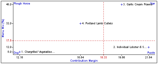
Now, we want to consider each of the items on the menu and note where it appears on the graph and what (if any) action we want to take on the individual menu item. Lets look at each of the items on our sample menu above.
1. Chargrilled Vegetables With Cajun Spices
This item is ranked as a Dog. Basically, it doesn't make much money nor is it popular with the customers (compared to the other items on the menu). You should consider replacing this menu item with another that may be more popular and profitable. There are cases where there are 'must have' dishes on a menu and you will have no choice but to carry those dishes, but in most cases you should consider replacing the menu item.
2. Individual Lobster & Sandcrab Lasagne
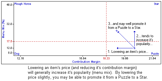
This item is a Puzzle and returns a good profit, but just isn't as popular with the customers as we might like. We need to ask ourselves: 'What do we need to do to make this item more popular?'. The obvious action is to lower the price slightly. While this will reduce it's profitability, we may just increase it's sales appeal, and hence it's popularity, enough to rank the item as a Star in the future. The following screen shot shows how this can work.
3. Garlic Cream Prawns
This item is already a Star and we generally leave them alone. Stars are profitable and popular. Don't fix something that isn't broken.
4. Portland Lamb Cutlets
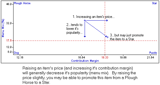
The Lamb Cutlets rank as a Plough Horse. They sell well, but just don't make as much profit as we'd like. Generally, the best action with plough horses is to increase their price slightly. This will reduce their popularity somewhat, but this is generally offset by the increased profit. If you judge the price adjustment correctly, you may well be able to promote a Plough Horse to a Star. See the following diagram.
As you can see, reading menu engineering graphs isn't difficult and with a bit of familiarity, you can tell a lot about a menu from a quick glance at a graph.